The economics of Pantone and its colours
In today’s Finshots, we tell you why Pantone’s Color of the Year is such a big deal in the design world, and the economics behind the company whose colour formulas quietly show up in products we see and use every day.
But here’s a quick sidenote before we begin. This weekend, we’re hosting a free 2-day Insurance Masterclass where we’ll walk you through simple rules to pick the right insurance plan and the common mistakes you should avoid.
📅 Saturday (Tomorrow), 6 Dec ⏰at 10 AM: Life Insurance
How to protect your family, choose the right cover amount, and understand what truly matters during a life claim.
📅 Sunday, 7 Dec ⏰at 10 AM: Health Insurance
How hospitals process claims, common deductions, the mistakes buyers usually make, and how to choose a policy that won’t disappoint you when you need it most.
👉🏽 Click here to register while seats last.
Now, on to today’s story.
The Story
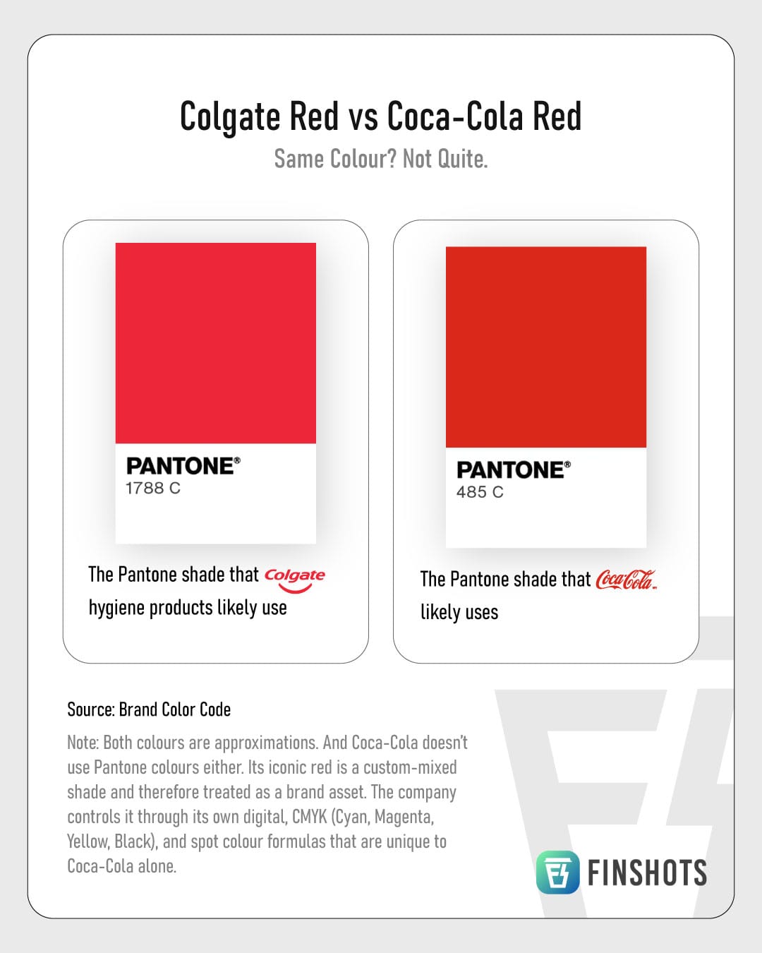
Coca-Cola and Colgate consistently top the charts as the world’s most purchased FMCG products. And you’d probably agree. Chances are you brushed your teeth with Colgate this morning, if not sipped on a Coke.
But here’s a thought. If one day Colgate suddenly switched to Coca-Cola’s red, and Coca-Cola borrowed Colgate’s, would you notice?
You might shrug and say, “Meh, red is red.” But here’s the fun bit. It isn’t.
Colgate likely uses Pantone 1788 C. Coca-Cola, meanwhile, doesn’t have a fixed Pantone shade. Its red is a custom-mixed brand asset, created using CMYK values (that’s cyan, magenta, yellow, and black). But its closest Pantone cousin is 485 C. And yes, when you put the two side by side, the difference is actually huge.
Pantone, for the uninitiated, is an American company best known for its colour standardisation system called the Pantone Matching System (PMS). Think of it as a “dictionary of colour”. Designers refer to Pantone codes to ensure the exact shade you want is the shade they print.
Now imagine Starbucks printing lakhs of cups around the world. If Starbucks tells a printer in New York and another in Shanghai to use Pantone 3425 C, both know exactly what green to mix and how to mix it. The result? Two cups printed continents apart, but looking identical.
This kind of consistency matters a lot in design and packaging.
Take Kodak, for example. Before PMS came along, Kodak used multiple printers for its film boxes, which led to wildly varied yellows on store shelves. Some packs were bright and cheerful, while others looked dull. Customers, whether consciously or not, chose to buy the brighter yellow, assuming it meant fresher film. The darker boxes were deemed old or low-quality. It became a real problem for sales.
To fix it, Kodak adopted the Pantone system and locked in an official, standardised “Kodak Yellow” or Pantone 1235 C. From then on, no matter where it was printed, Kodak’s yellow stayed Kodak’s yellow. Confusion dropped, and brand identity strengthened.
And while we don’t have exact numbers for Kodak’s gains, we do have a striking example from Kraft, the global cheese and ketchup giant. When Kraft standardised Heinz Red using PMS, the results in Turkey were apparent. 97% of customers could visually tell Heinz apart from its competitors. Heinz ketchup usage rose 24%, and non-Heinz branded ketchup refills by street vendors dropped by 73%.
That’s the power of Pantone.
But here’s the thing. Pantone is essentially just a company that sells PMS colour guides with codes and recipes for mixing shades. That’s their product. Yet somehow, it’s become a global monopoly in colour standardisation. So how does that add up, you ask?
To understand that, we need to rewind to 1956.
A young chemistry graduate named Lawrence Herbert joined M&J Levine, a small New Jersey printer that made retail display cards for cosmetics and women’s tights. His job involved hand-mixing delicate colours for product swatches because it was hard to buy the exact shade you needed from ink manufacturers.
Retail brands desperately needed consistent colours, especially flesh tones for hosiery and cosmetics. But printers and ink makers were working with vague names like “light beige”, “sand”, or “almond”. Some even relied on odd references like a magazine cut-out, or even a pet dog’s fur, to match a shade. Funny as it sounds, the outcome was chaotic. Minor changes in paper, ink batches or suppliers led to mismatches, reprints, and unhappy clients.
Herbert realised this wasn’t just an ink problem, but also a coordination problem. So he devised a solution — ink “recipes” that used specific base colours to reproduce exact shades every single time. If printers used the same bases, they’d get consistent results.
Around the same time, M&J Levine was in bad shape. Almost everything except its ink business was losing money. So Herbert bought its technology assets for about $50,000 and spun them off into a new company called Pantone. The name itself is a blend of “pan”, meaning many or across from Greek, and “tone”, meaning hue.
And then, just a year later in 1963, Herbert launched the first PMS, which was a fan-style booklet of printed swatches, each with a number and an exact ink formula based on a fixed set of base pigments.
To make sure the system took off, he first created a sample page explaining how it worked and sent it to ink makers.
Then he started doing something clever. He made sure that everyone in the ecosystem had a reason to adopt Pantone. He went straight to designers and advertising agencies, the people who specify colours. Once designers started writing PMS codes into briefs, printers had little choice but to adopt Pantone. And once enough printers supported it, designers who didn’t use Pantone, risked miscommunication and reprint costs. It was the classic network effect in action.
On top of that, Herbert persuaded 20 of the 21 small ink manufacturers to adopt his numbering system. Once most of the supply side standardised around Pantone formulas, it became nearly impossible for a rival system to take root. Because switching would require relearning everything, and no one wanted that.
Then came the defining moment. In 1968, Pantone sued Para-Tone, a competitor that tried to produce a near-identical colour guide. Para-Tone argued that colours can’t be copyrighted. After all, no one can own red or blue. Pantone pushed back with a smart counter-argument. Maybe it couldn’t own colours, but it could own the arrangement and presentation of colours that made up its system. Just like dictionaries don’t own words. They own the specific way they’re organised.
Pantone won. And that early legal victory cemented that its codes, recipes and system were proprietary, even if the idea of “defining colours” wasn’t. It scared off imitators and slowly turned Pantone into a near monopoly.
And over time, Pantone slowly seeped into very trivial, unusual, and sometimes even thoughtful spaces. Calvin Klein reportedly kept a Pantone chip in his kitchen to show his chef the exact colour he wanted his coffee to be. In Japan, hospital workers wear Pantone-coloured scrubs (clothing worn by healthcare workers) in different shades for each day of the week so that patients needing acute long term care can tell what day of the week it is. Heck, even IPL jerseys — CSK yellow, RCB red, are colour-matched using Pantone so they look exactly the same season after season.
But to become such a giant, you need repeatable revenue. And just selling colour guides doesn’t quite cut it. Just think about it. Pantone could release a guide today, and clients might buy it once and never need another. Especially if they’re, say, a formal textile company that only works with a limited palette of blacks, whites, browns, and beiges.
Pantone saw that coming, and engineered a way around it.
Ink and paper naturally oxidise and yellow over time, even if it’s swatched on premium quality paper or fabric. So Pantone explicitly recommends replacing guides every 12–18 months to maintain colour accuracy. In other words, what looks like a one-time reference book quietly becomes a recurring subscription.
And these guides don’t come cheap. A full professional plastic-chip set — stacked in a rotating tower display, can cost upwards of $9,000. Smaller guides range from $300 to $2,000 each. Creative agencies, print shops, textile makers, and brands often buy multiple sets for different offices, teams, or processes, keeping revenue steadily flowing.
This single product category is estimated to account for roughly half of Pantone’s business. The rest comes from consulting, licensing, and digital tools. Manufacturers — from paints to plastics to fashion, pay to license Pantone colours. The company even developed the formulation for “Minion Yellow”, the exact shade used for the characters in the animated film, Despicable Me, and its franchises.
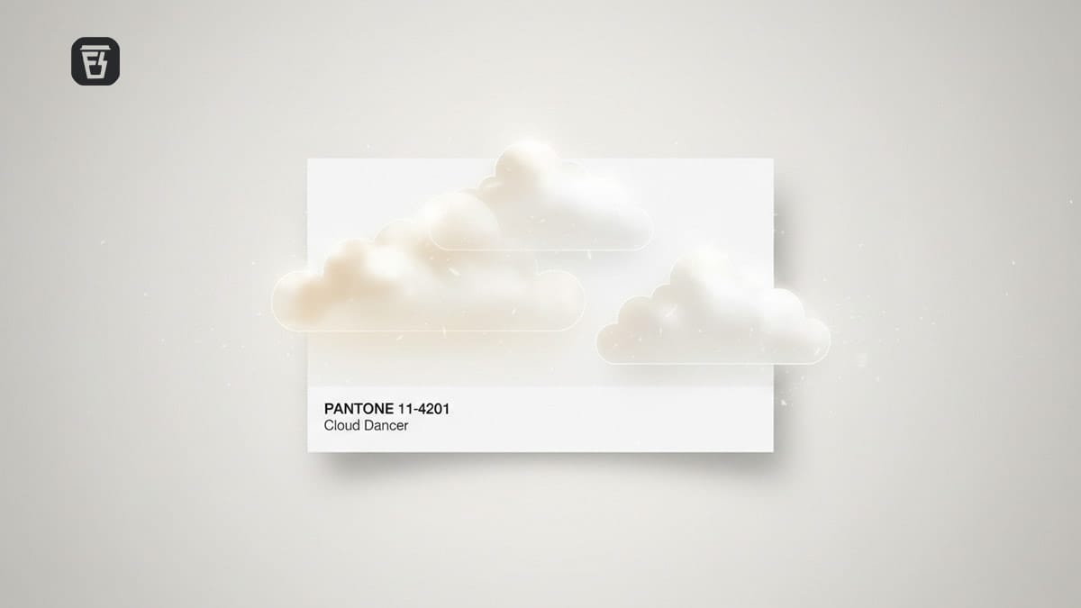
That brings us to the other, and arguably the most fascinating strategy that nudged us to write this story: the Pantone Color of the Year, which the company revealed just yesterday. Every December since 2000, the Pantone Color Institute unveils a colour for the year ahead, sparking media buzz and shaping trends across fashion, design, advertising, and consumer products. 2026’s colour is Cloud Dancer, a shade of serene white (Pantone 11-4201).
The annual reveal earns Pantone tonnes of free publicity, reinforcing its image as the global authority on colour. And the chosen shade, whether 2022’s Very Peri, 2023’s Viva Magenta, 2024’s Peach Fuzz, or this year’s Mocha Mousse, quietly influences shopping behaviour and product development across industries. Pantone cites studies suggesting that colour steers up to 85% of purchasing decisions and can boost brand recognition by 87%.
The Color of the Year also fuels licensing revenue, as brands roll out limited-edition products in the chosen shade, often in partnership with Pantone. The Moto Razr is a classic example. It releases phones in the newly announced colour every year, and 2026 is likely to be no different.
So if you suddenly see this specific pastel shade of white everywhere, in merchandise, marketing, cosmetics, or clothing, remember, it’s no coincidence. It’s Pantone’s subtle marketing machine at work, cementing its soft power around the world.
Until next time…
If this story helped you understand the economics behind Pantone and its Color of the Year, do us a favour and share it with your friends, family, colleagues, or even total strangers on WhatsApp, LinkedIn, or X.
Last few days left to register for Finshots Idea Lab Season 2!🥳
Students, this is your chance to bag ₹2.25 lakh in cash, pre-placement interviews, cool goodies, and serious bragging rights.
Click here to apply. You don’t want to miss this!