Look Ma, India is shining!

Yes, we know we’ve written a lot about economics this week, but bear with us for one more day? Because in today’s Finshots we explore a chapter from the Economic Survey that has gone pretty viral. And viral is always exciting, no?
The Story
Have you ever revisited a town after many years only to look at the scenery and go — “Damn this place has changed a lot? Lights everywhere it seems.”
Well, you wouldn’t be alone. If a place is well lit at night, it probably tells you there’s something brewing there. Think about it — Artificial lights often equate to more houses, more shops and a higher population density. It gives you a good estimate of electricity consumption. It can tell you about economic progress and a whole host of other things.
And this was made apparent when the Economic Survey 2021–2022 dedicated a whole chapter to the subject calling it — Tracking development using satellite images and cartography. Now obviously, this isn’t just limited to night-time lighting. The chapter also talks about a whole host of developments in satellite imagery and cartographic techniques. But our story will focus on Night Time Lights (NTL) since it has some amazing visual appeal.
For instance, look at the two images below.
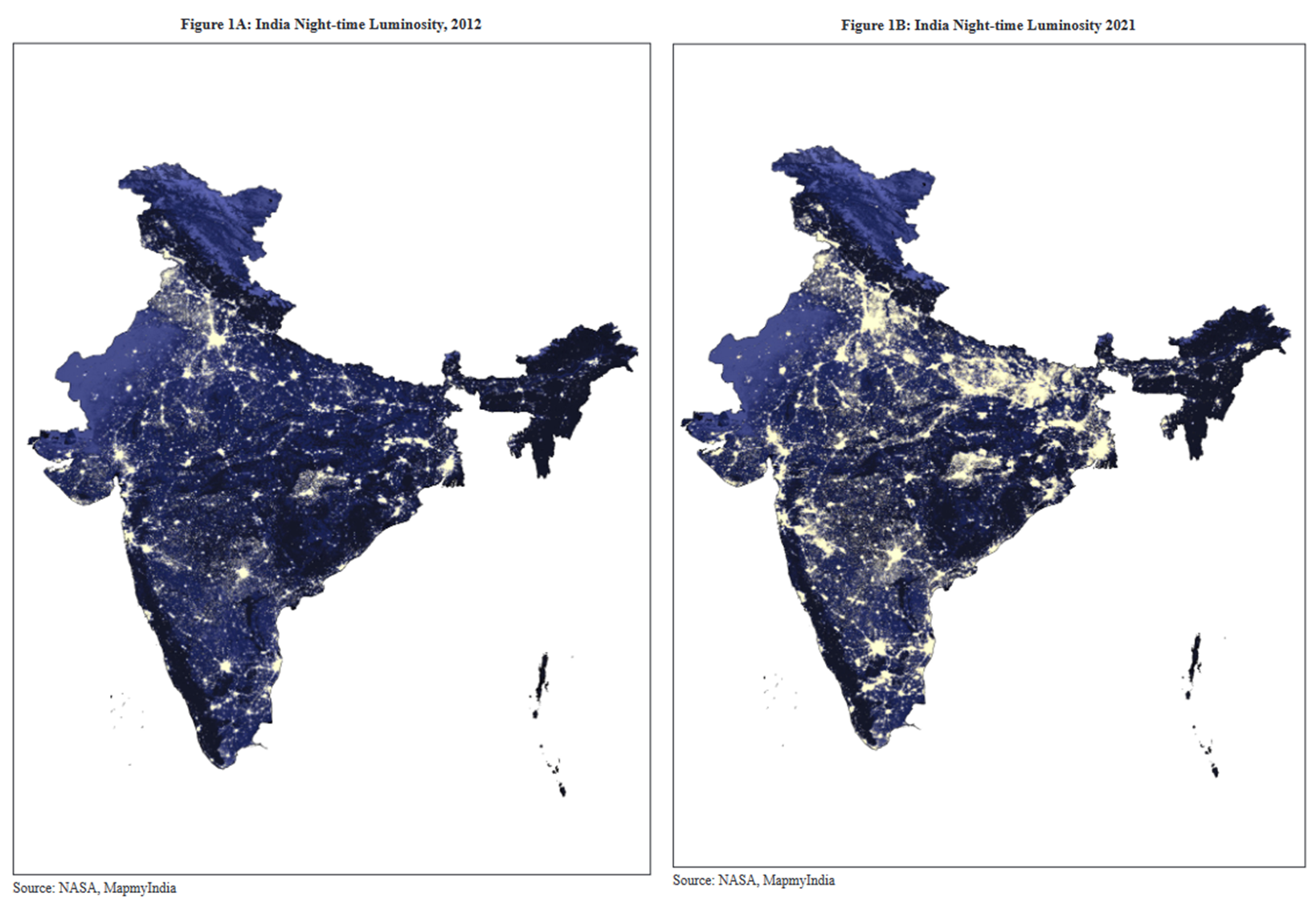
The satellite image on the left is from 2012. The second image is from 2021. See how India’s lit up differently now as opposed to 2012. Well, it tells you something. And according to the economic survey it “provides an interesting representation of the expansion of electricity supply, the geographical distribution of population and economic activity, urban expansion as well as growth of ribbon developments between urban hubs.”
Now that’s too many things to focus on at once. But let’s look at that first point — Electricity supply.
The government may contest that they’ve electrified a village. But that would tell you precious little about the actual scope of electrification. For instance, according to the government, a village is electrified if at least 10% of the households have power connections. And if electricity is made available in public places like schools and community centres. But what about the remaining households? What about power cuts and intermittent supply? With Night-time luminosity images you could probably get a better estimate of the true scope of electrification.
Elsewhere, you don’t need to wait for census data to tell if there’s a population spurt in a given area. You could use NTL data to deduce this and more. It can also give you insights on income inequality. If you have economic activity concentrated in one area, satellite imagery of this kind can help you course correct.
For instance, in 2015, Sam Asher of the World Bank and Paul Novosad of Dartmouth College combined census and NTL data to conclude that Uttarakhand, Jharkhand and Chhattisgarh fared much better economically after they split into 3 different states. So clearly there’s a lot of utility here. However, it’s imperative that we don’t get too ahead of ourselves here.
For starters, satellite imaging was never conceived to study economic activity. In fact, most satellites lack the instrumentation to accurately detect emissions of artificial light. Second, you can’t really differentiate between different sources of light while studying these images. You could have light coming out of a textile factory and you could have light coming out of a building housing highly skilled software developers. The images will have you convinced that there's some activity in both buildings. But the economic output is vastly different.
And finally, as another report notes —
“The luminosity data coming from the existing satellites also run into trouble distinguishing areas of extremely low development from areas with no development at all, often interpreting these low levels of light as just noise, unable to be differentiated from zero. In places of higher development, light saturation can have the opposite effect, leading to overestimates of economic data.”
So NTL data can offer insights on some occasions, especially when you have little to no census data. But over-reliance on satellite imagery can lead you astray as well.
Finally, not everybody is convinced that the pictures presented in the Economic Survey do in fact accurately reflect progress. It’s easy to play with these images and so you have to be extremely careful while dealing with these data sets. So yeah, NTL could become a useful tool to assess progress in the coming years. But we must exercise caution while we dabble with these things.
Until then…
Don't forget to share this article on WhatsApp, LinkedIn and Twitter
Also, at Finshots we have strived to keep the newsletter free for everyone. And we’ve managed to do it in large parts thanks to Ditto — our insurance advisory service where we simplify health and term insurance for the masses. So if you want to keep supporting us, please check out the website and maybe tell your friends about it too. It will go a long way in keeping the lights on here :)